Bounce Arcade

Artwork
To be used as provided where necessary without any alteration or change.
Key art
Key Art
In-Game UI + Web + Marketing
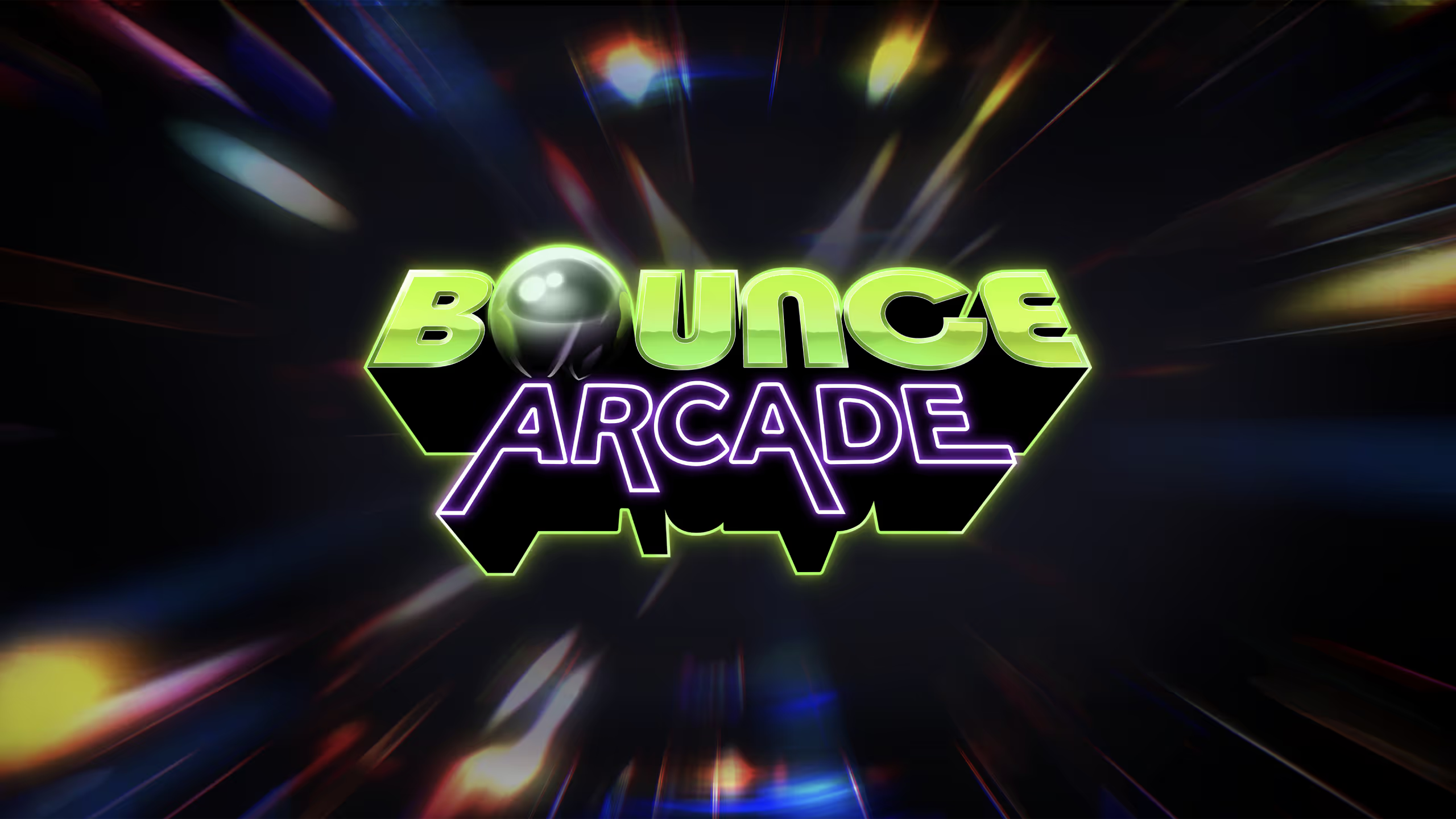
Logo
Branding marks to be used as they are provided, without any alterations or changes as the driving visual cue for all Bounce Arcade messaging.

Primary
Primary use logo when able to be presented at a large size. Should always be used with the game’s Key Art.
Bounce Arcade Primary
Secondary
Only to be used after full context is given or when a square placement in necessary. Be sure to have the game title within view with use of the seal mark.
Bounce Arcade Square
Color
Brand colors to be used in all marketing materials and any forthcoming in-game UI elements.
Primary
ultraViolet
HEX
#7f4ff2
emeraldSynth
HEX
#bdf92b
Secondary
cyberPink
HEX
#d20d53
blueScreen
HEX
#00c7ff
terraCortex
HEX
#ff8b02
Purple Scale
Purple 100
HEX
#f9f5ff
Purple 200
HEX
#c9acff
Purple 300
HEX
#a075ff
Purple 500
HEX
#7f4ff2
Purple 700
HEX
#4f23ad
Purple 800
HEX
#26095c
Purple 900
HEX
#04000a
Green Scale
Green 100
HEX
#fefff5
Green 200
HEX
#f2ffa3
Green 300
HEX
#dcff58
Green 500
HEX
#bdf92b
Green 700
HEX
#8aad06
Green 800
HEX
#4e5c00
Green 900
HEX
#090a00
Pink Scale
Pink 100
HEX
#fff5f7
Pink 200
HEX
#ffa3ba
Pink 300
HEX
#f75284
Pink 500
HEX
#d20d53
Pink 700
HEX
#a50032
Pink 800
HEX
#5c0017
Pink 900
HEX
#0a0002
Typography
Situational uses for how, when, and where branded fonts are applied when speaking as MMC’s brand voice.
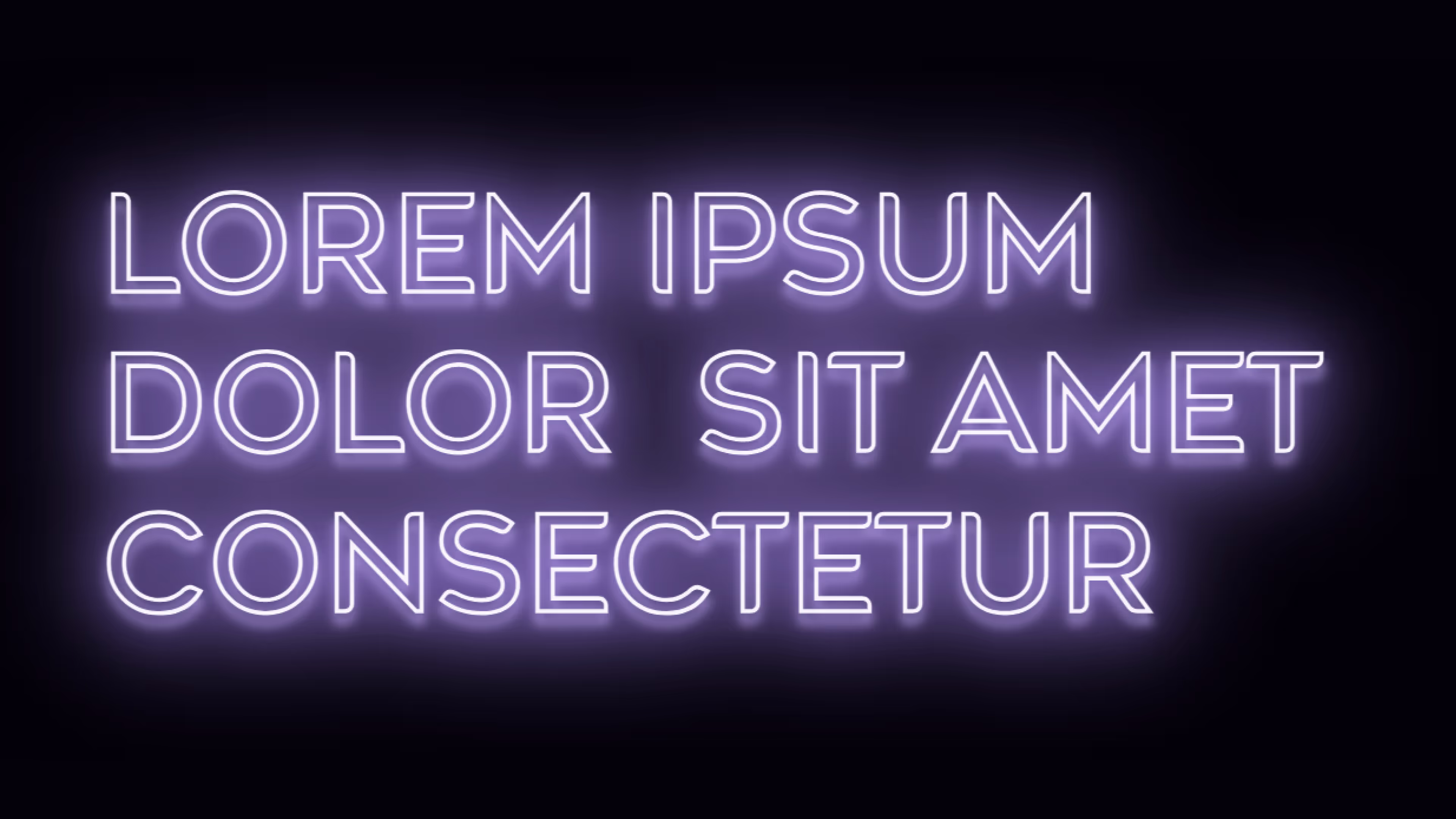
Headline
For short to midform messaging that is intended to give context to it's owned section. This style is also to be used in uppercase transformation. Not to be used for long form narrative. All caps is preferred, so headlines should not be used for long bits of text.
Note for headings
Outlined is preferred for headlines. When headlines are needed to be smaller (or within 20 type units from paired body copy), the type should forfeit this effect and remain solid.
Text Effect
When applying the neon effect to headlines and elements, use a similar 3-effect layered method as shown below.
filter:
drop-shadow(0 .08em .04em var(--color--200)) drop-shadow(0 0 .4em var(--color--200))
drop-shadow(0 0 .2em var(--color--300));
Agenor
Web + Marketing
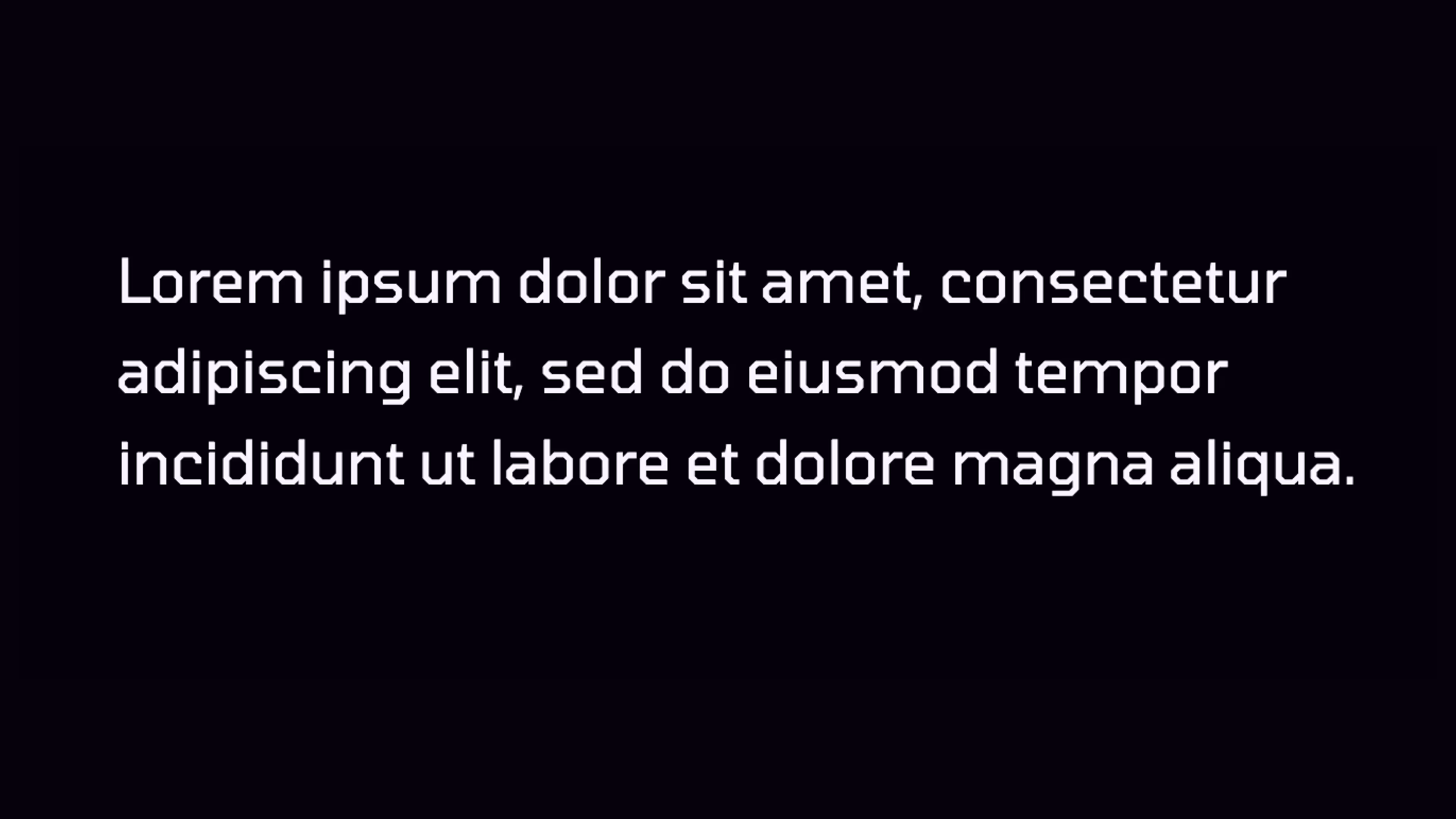
Paragraph
For long-form copy that is intended to be fully legible. Not to be used in sizes larger than headlines type.
Tomorrow
Web + Marketing